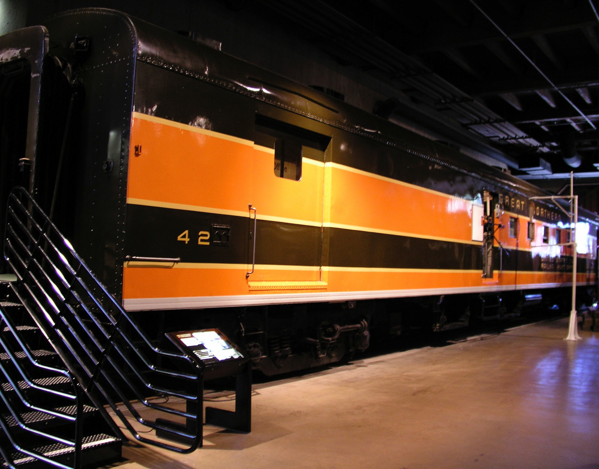
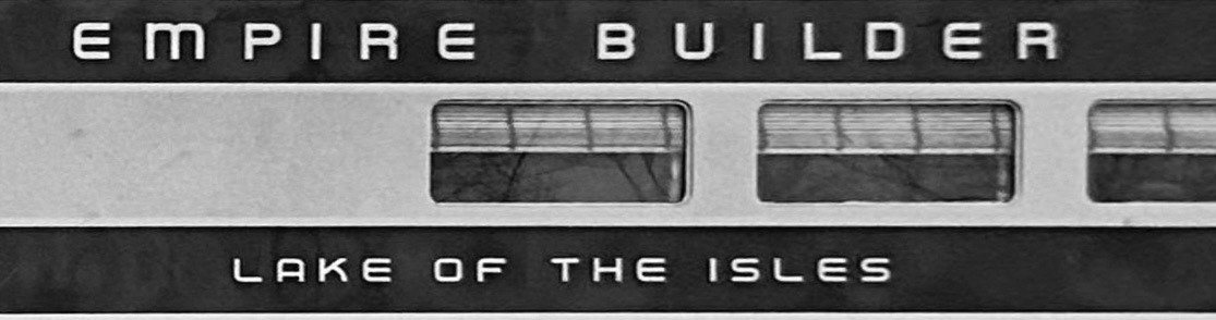
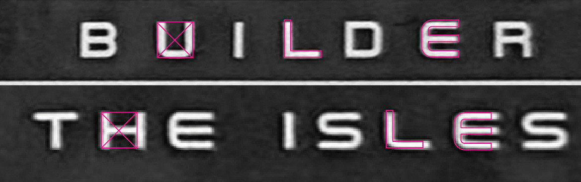
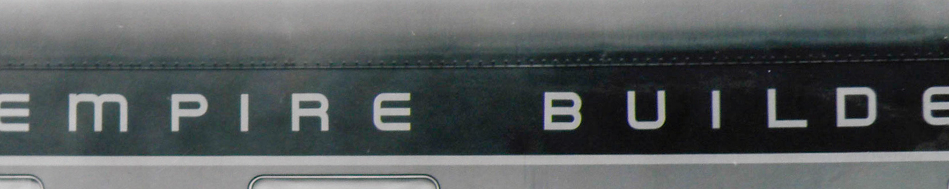
The lettering on this 1947 builders photo of diner 1250, Lake of the Isles, shows the differences between the extended and square fonts - notice the differences in the "L" and "E". Also note the square "L" in "BUILDER" and the round "L" in the car name. (The photo has been "un-distorted" using Photoshop to approximate a full-side view).
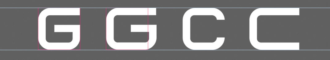
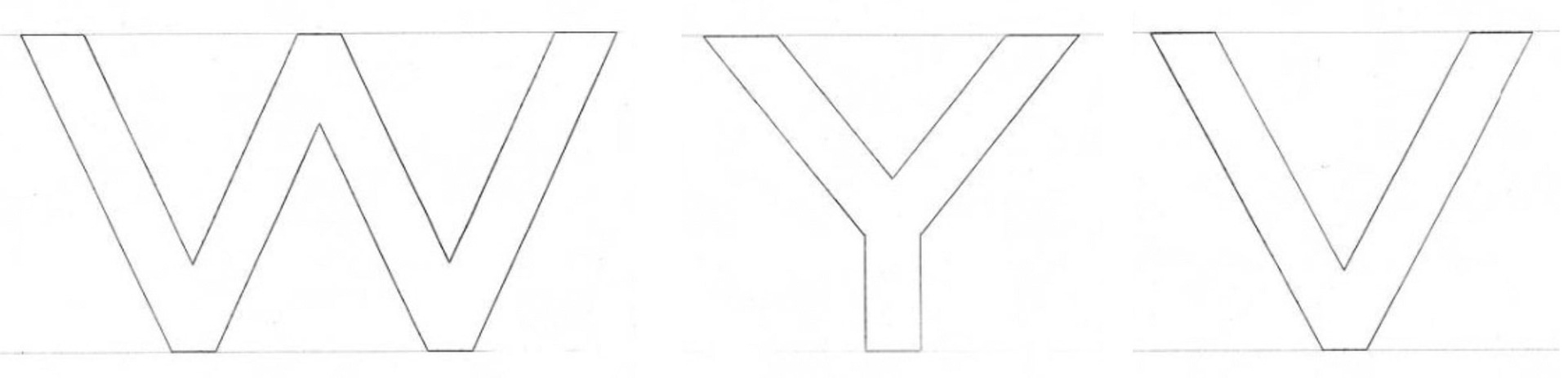
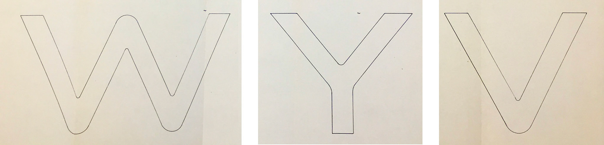
The difference between the square and extended letters: The pink outline shows the square proportions.
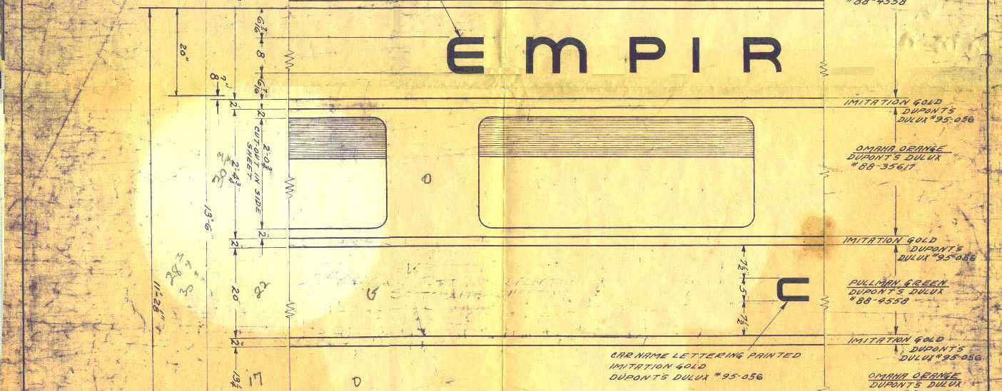
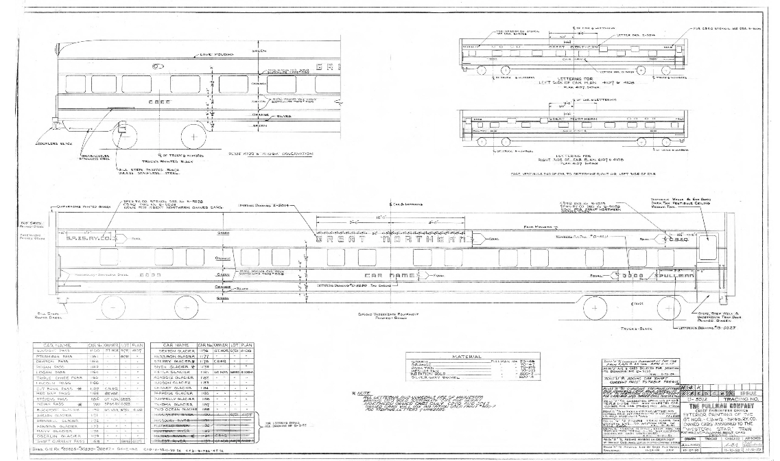
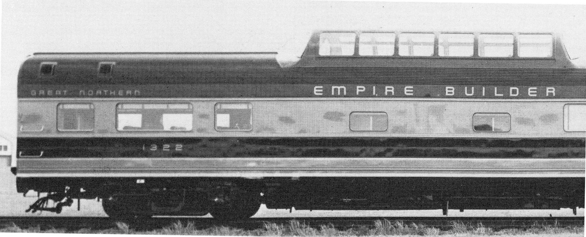
This detail from another drawing from the MNHS dated 1946 that shows the original EB lettering. MNHS
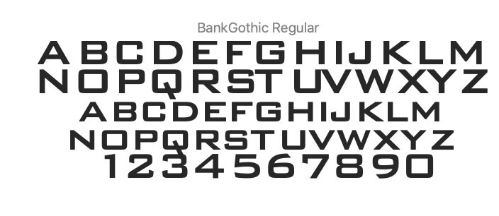
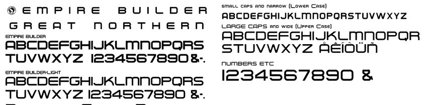
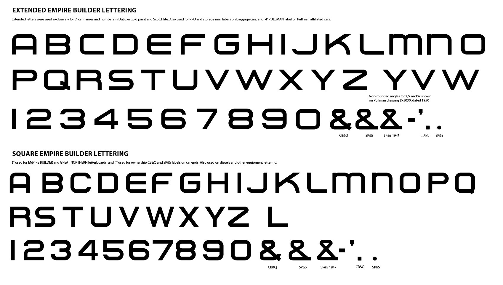
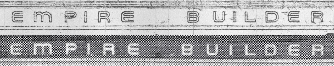
Ben Coiffmann's Empire Builder font uses upper and lower case to switch between the square (narrow) and extended versions of the font. there is also a "light" version here. Note that the font also omits alternate versions of some letters that appear in Pullman drawings such as the squared-off "L" used in "BUILDER" on the EB car's letterboards. The font also differs from the source drawings with a straight-ended "C" in the square (narrow) version of the font, and the horizontal arms of the "F" are equal, but should have a shorter lower arm.
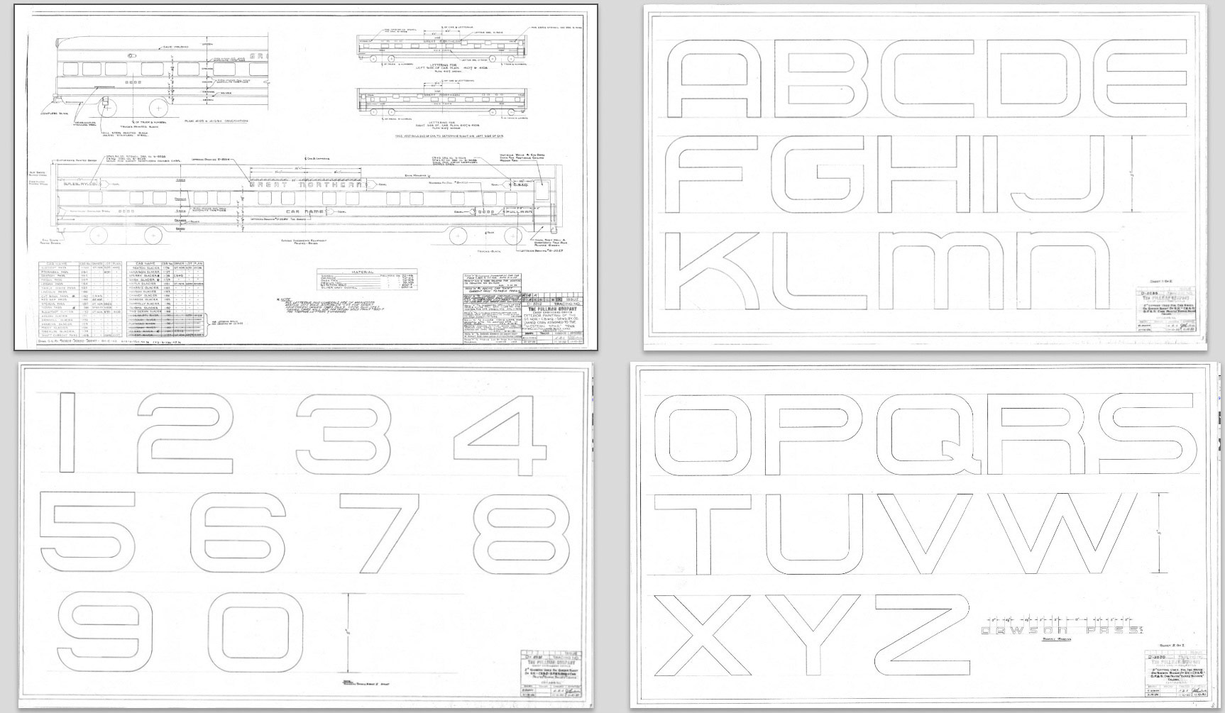
Detail from Pullman lettering drawing D-5012, Newberry Library, Chicago
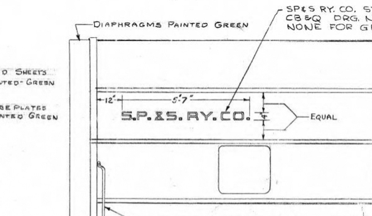
Detail showing SP&S lettering
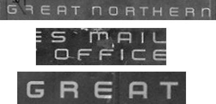
G.N. Ry Car Names Lettering & Spacing - MP Dept. St. Paul, Minn. July 22, 1949. Drawing 44080 - Minnesota Historical Society
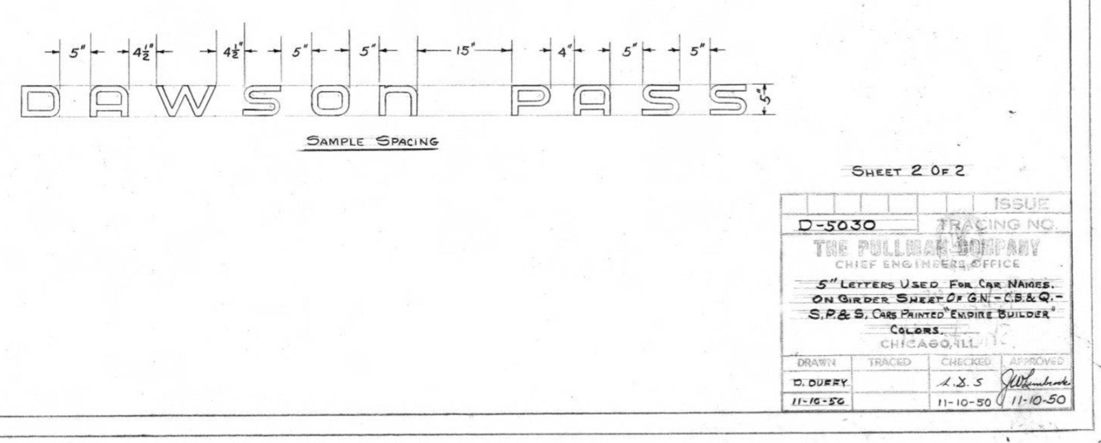
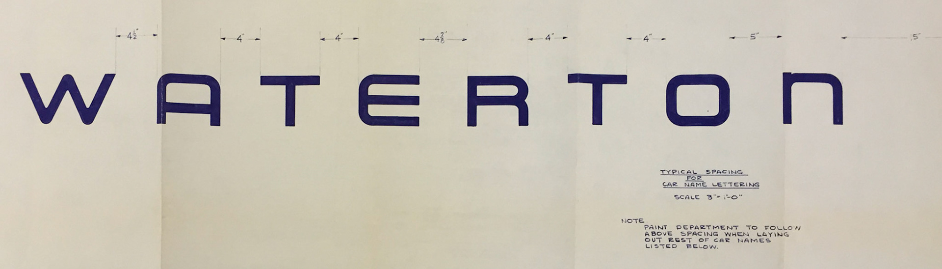
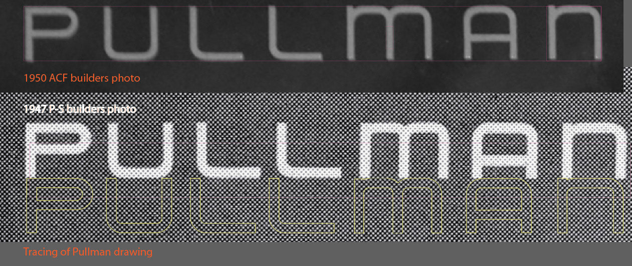
Pullman's sample for letter spacing on drawing D-5030, sheet 2, from the Newberry Library.
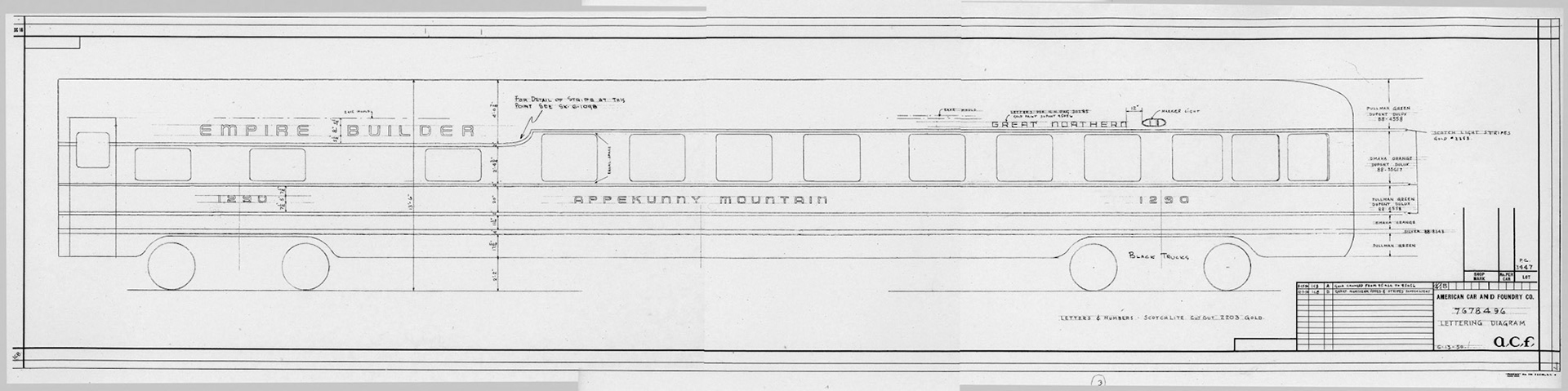
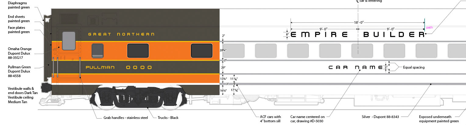
This lettering diagram from the authors collection shows letter placement for the 1950 sleeper-lounge-observation cars in the Mountain series produced by American Car and Foundry. These cars had the unique case of the upper gold stripe curving up to accommodate the outsized windows on the observation section, and that transition curve deserved its own drawing to define its shape. (Mercantile Library, ACF archives, St. Louis, Mo. - Author's collection)
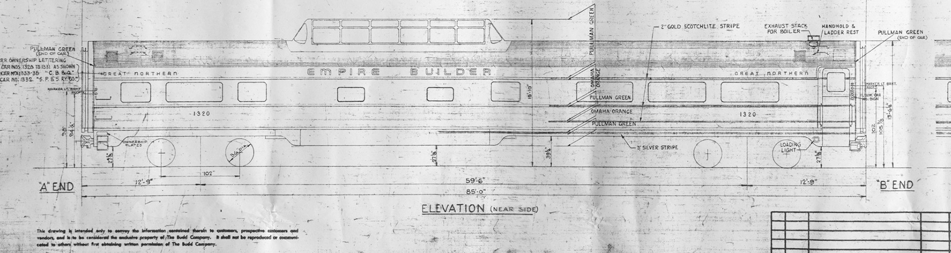
This Budd drawing from 1955 shows the general arrangement of lettering used on the short domes. (Author's collection)
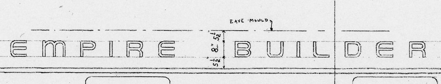
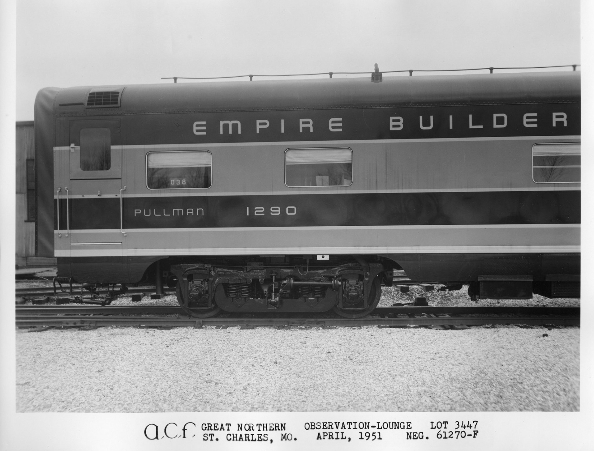
ACF drawing shows rounded "L" on "BUILDER", but the square L was used on the car. Sometimes the drawings did not reflect the reality!
Budd drawing compared to builders photo
ACF's lettering appears to be lighter weight than what Pullman used - another example of anomalies found during research.
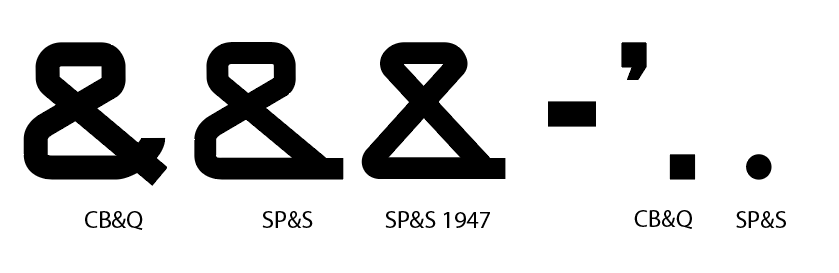
Variations of the ampersand seem to be related to car ownership.
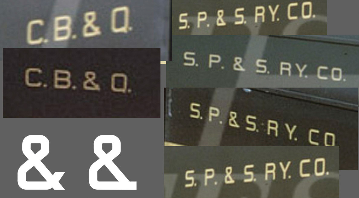
Various ampersand variations
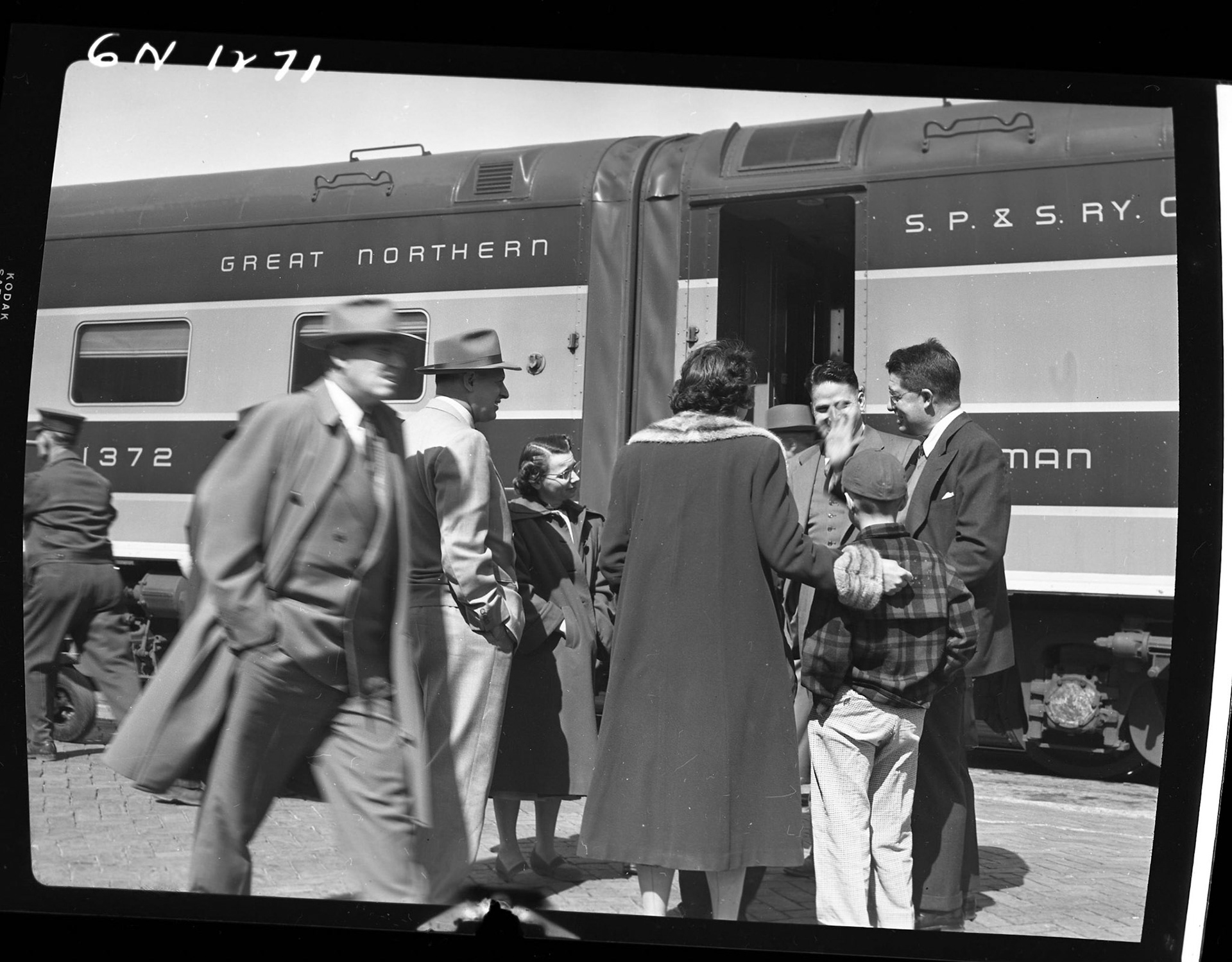
Luckily John Barringer III got this snapshot that shows another version of the ampersand on an SP&S sleeper, probably from the 1947 version. Barriger Collection, Mercantile Library, St. Louis, Mo.
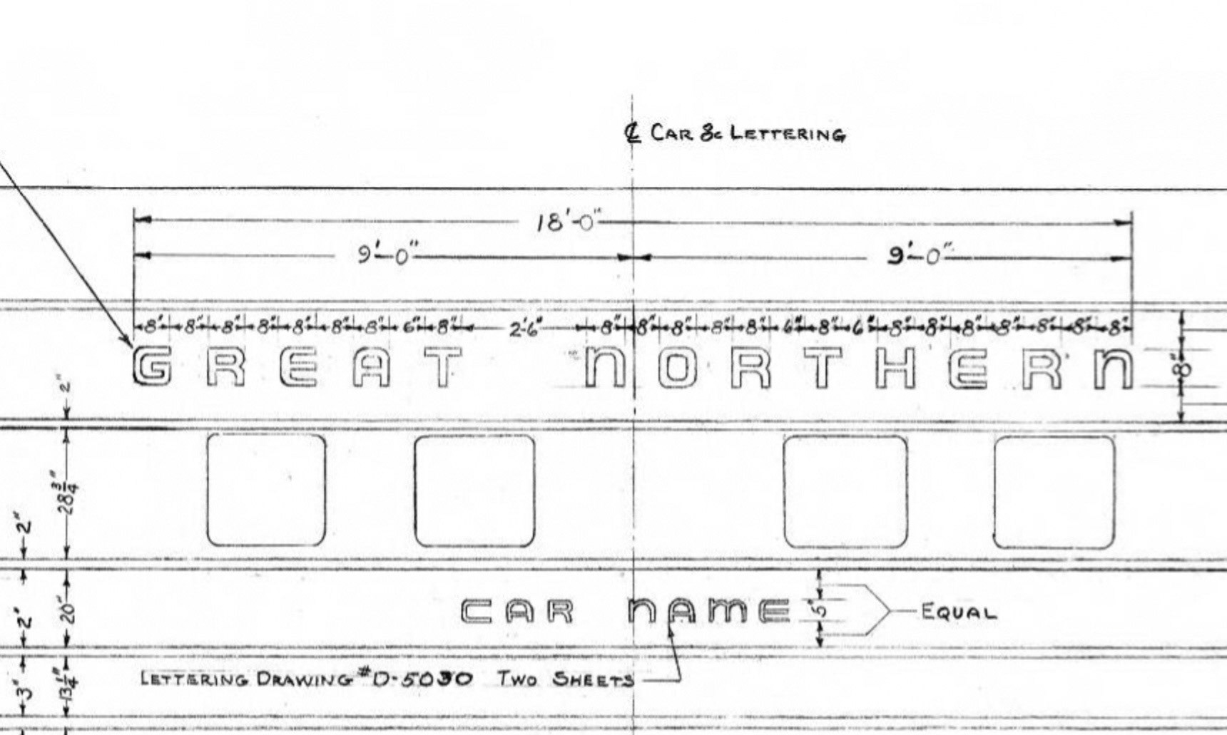
Pullman Empire Builder lettering diagram drawing number D-5030, 5" Letters used for car names on girder sheets of G.N. -C.B.&Q. - S.P.&S. cars, Newberry Library, Chicago.
G.N. Ry Car Names Lettering & Spacing - MP Dept. St. Paul, Minn. Drawing 44080, Minn. Hist. Soc.
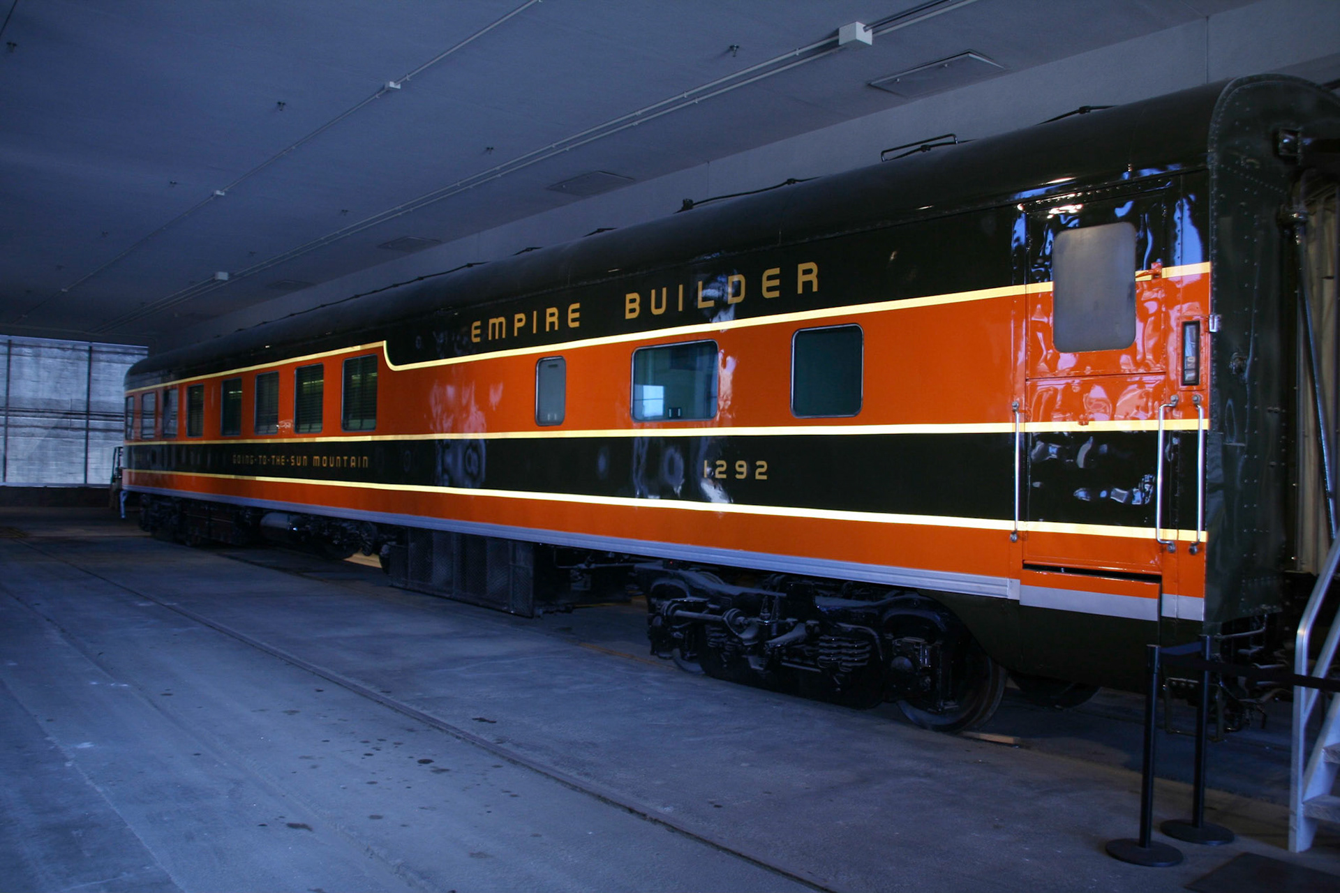
The Scotchlite stripes are evident in this flash photo of GN 1292 when it was on display at Kansas City Union Station. The lettering is painted. The car was renovated and repainted in 2006. (Ben Ringnalda photo)
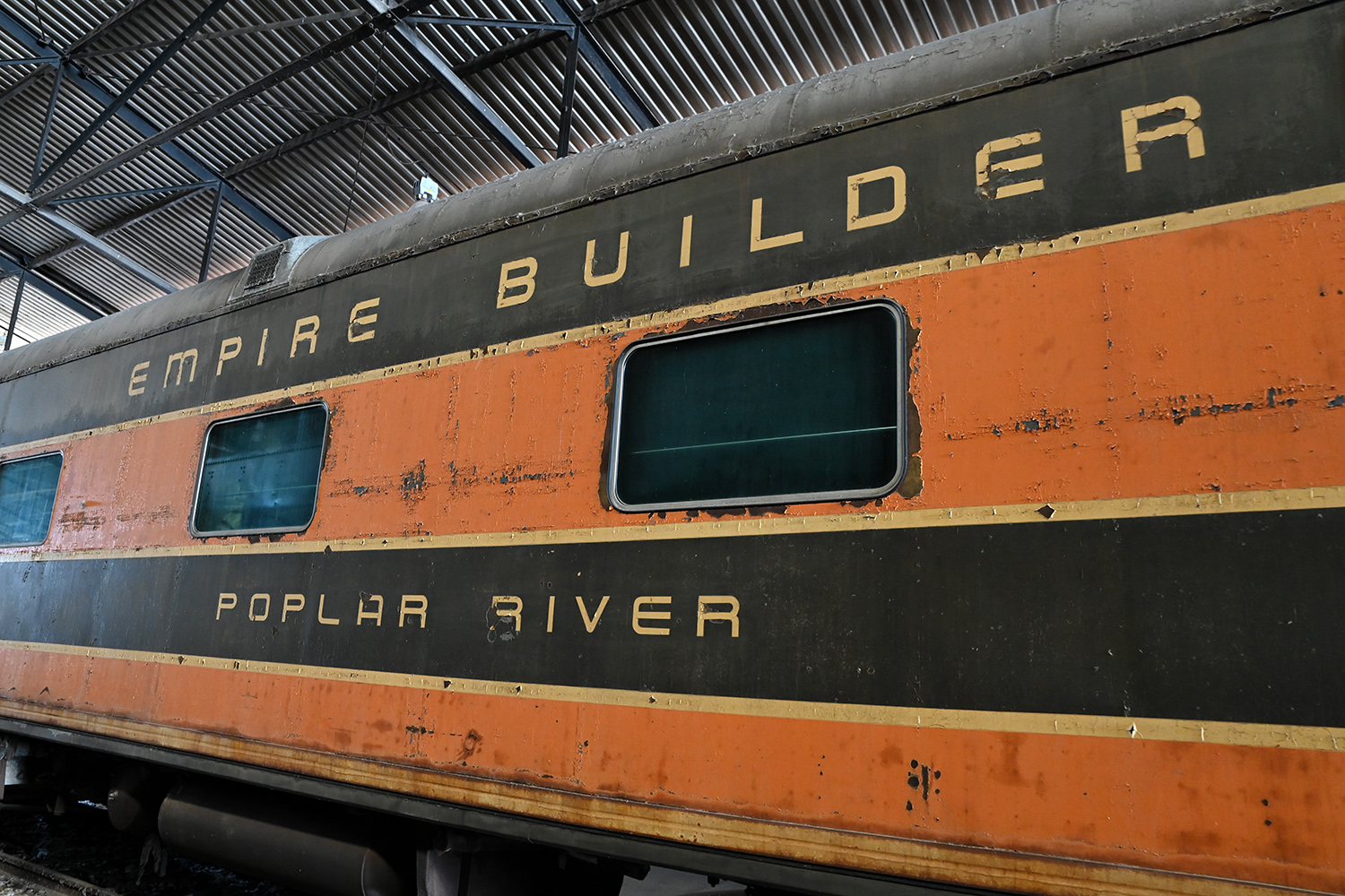
In this photo from the National Railway Museum in Green Bay shows Poplar River with peeling Scotchlite, including the train name on the letterboard. Note that the "V" in the car's name uses the rounded form of the letter. (National Railway Museum)